 DRAG
DRAG
 DRAG
DRAG
 MDH MDH
Manufactur Digital Hub (MDH) is a digital solutions company specializing in web development, mobile apps, UI/UX design, and SaaS products.
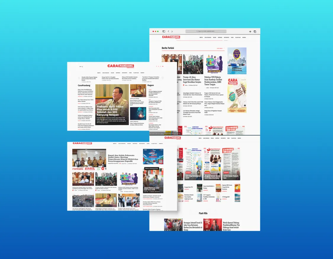
An online media platform with separately optimized responsive views for web and mobile, delivering a comfortable reading experience across every device.
Carapandang is an online media platform we built with a mobile-first approach while maximizing the desktop experience. What makes this project unique is the design decision to completely separate the web and mobile views — not just responsive, but truly two different experiences tailored to how users consume content on each device.
On mobile, the layout is optimized for fast vertical scrolling, one-handed navigation, and lightweight loading. On desktop, we leverage the larger screen real estate for multimedia content, sidebar navigation, and richer exploration features.
Tech stack: Laravel, Vue.js, responsive design with adaptive rendering, performance optimization for heavy media content.
Let's discuss your requirements and bring your ideas to life.